I worked with Quid Publishing (now part of Bright Press) to create the original presentation for this title before designing and authoring the complete book. It was published by Thames & Hudson in the UK and by Firefly Books in the US. Please don’t consider purchasing both editions of the book with a view that they have alternative content; the covers are different but the interior spreads are identical.
Here’s the blurb from the jacket:
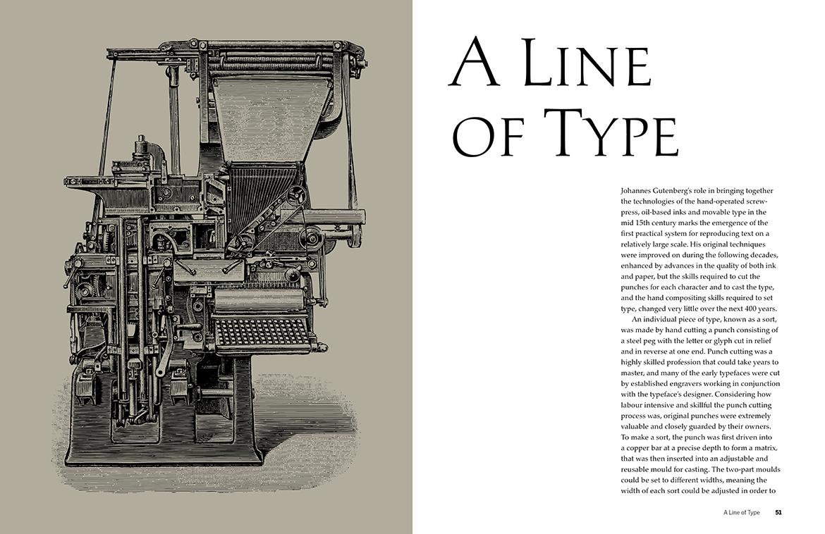
The Evolution of Type takes you on a journey through the development of type design and typographic style from the mid-15th century to the present day by way of 100 typefaces chosen to represent the key elements of style and form used by the punch cutters, calligraphers and designers of their day. Presented in chronological order according to original influence and/or release date, each typeface is discussed in terms of its origins and its impact on the design and print industry, and latterly for screen and digital use. Versions released in metal foundry type for hand-setting, as hot-metal type for the Monotype and Linotype machines, as phototype, and as digital revivals or originals, are covered in detail alongside information about the people responsible for the design and development of each adaptation of the typeface.
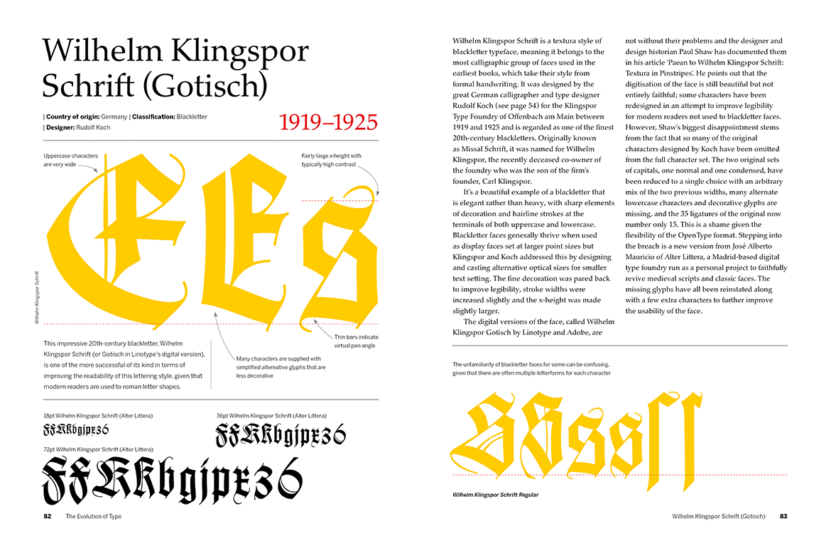
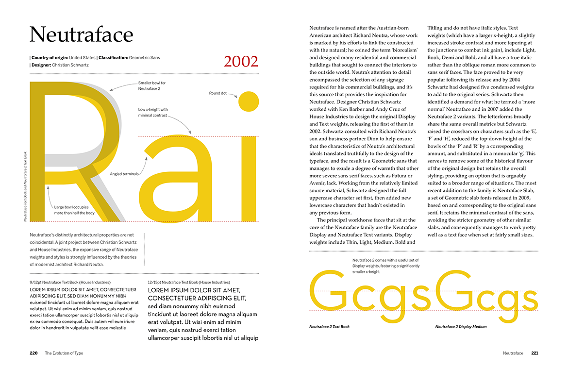
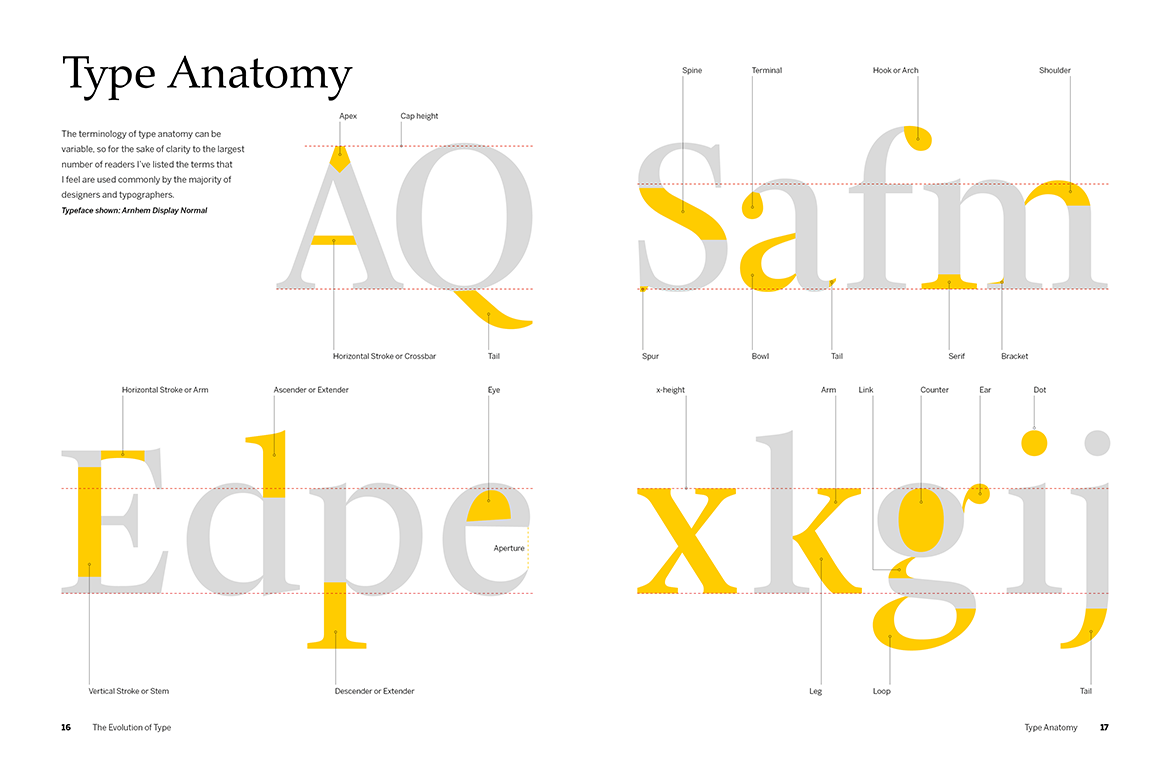
Key glyphs from each face are annotated to indicate the specific features that mark out how typeface design has evolved over the last 500 or so years, and visual comparisons are shown to illustrate how typefaces created years ago have influenced the design of many contemporary releases. For the general reader, this book gives a fascinating insight into the history behind the typefaces people read, and at the same time provides a valuable resource for typographers and designers to help inform their choice when selecting the most appropriate typeface for a project.

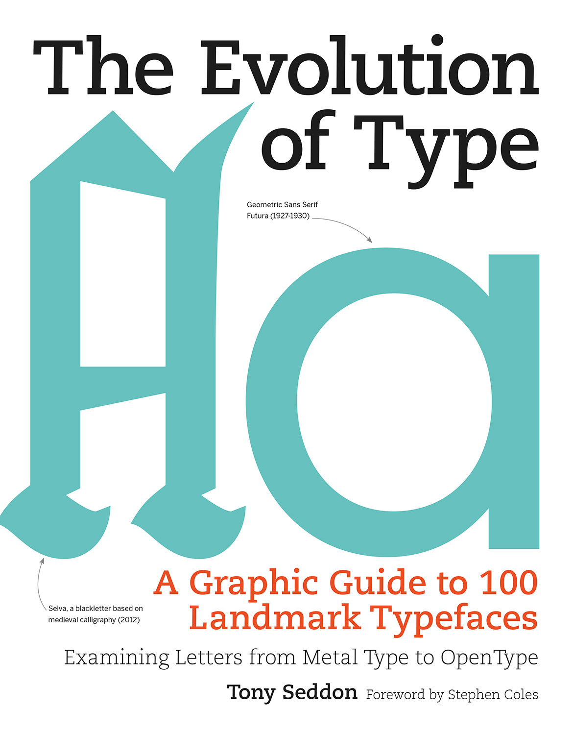
The UK edition published by Thames & Hudson (shown on the left) and the US edition published by Firefly Books.
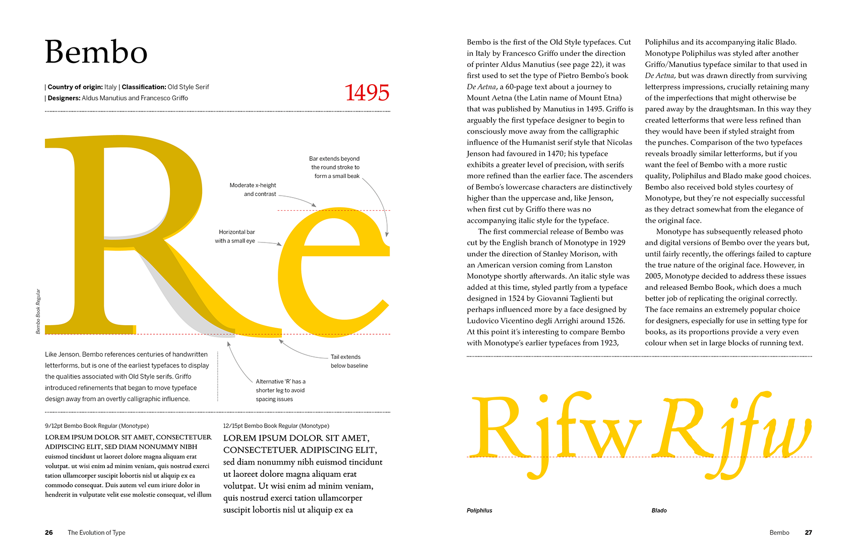
It’s worth pointing out how the chronology works as a couple of people have enquired about this point. As an example, the spread above indicates a date of 1495 for Bembo. This doesn’t indicate the year in which the typeface we know of as Bembo today was designed, it indicates the first appearance of the typeface cut by Francesco Griffo which would go on to influence the design of Monotype’s first commercial release of Bembo as a metal typeface in 1929. This approach to the chronology seemed from the start of the project to make more sense than ordering the typefaces simply by their “modern” release dates, given the title and premise of the book.