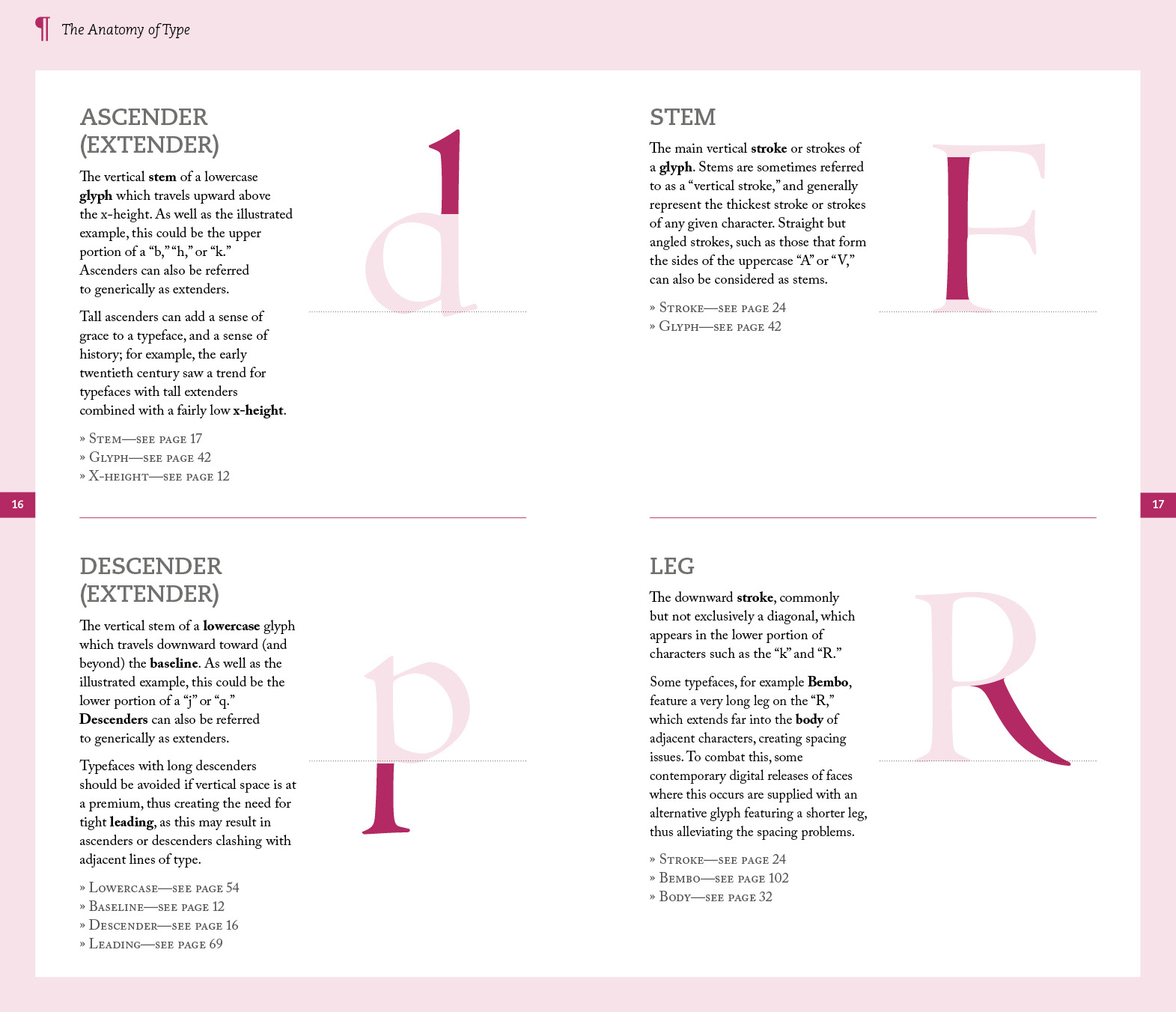
After creating the initial presentation spreads in-house, Brighton based co-edition publisher RotoVision (now part of Bright Press) asked me to author this title, published by Thames & Hudson in the UK and Yale University Press in the US. Alongside the text and visual content I took care of the design of the interior, adjusting and refining the layout as I created the material.
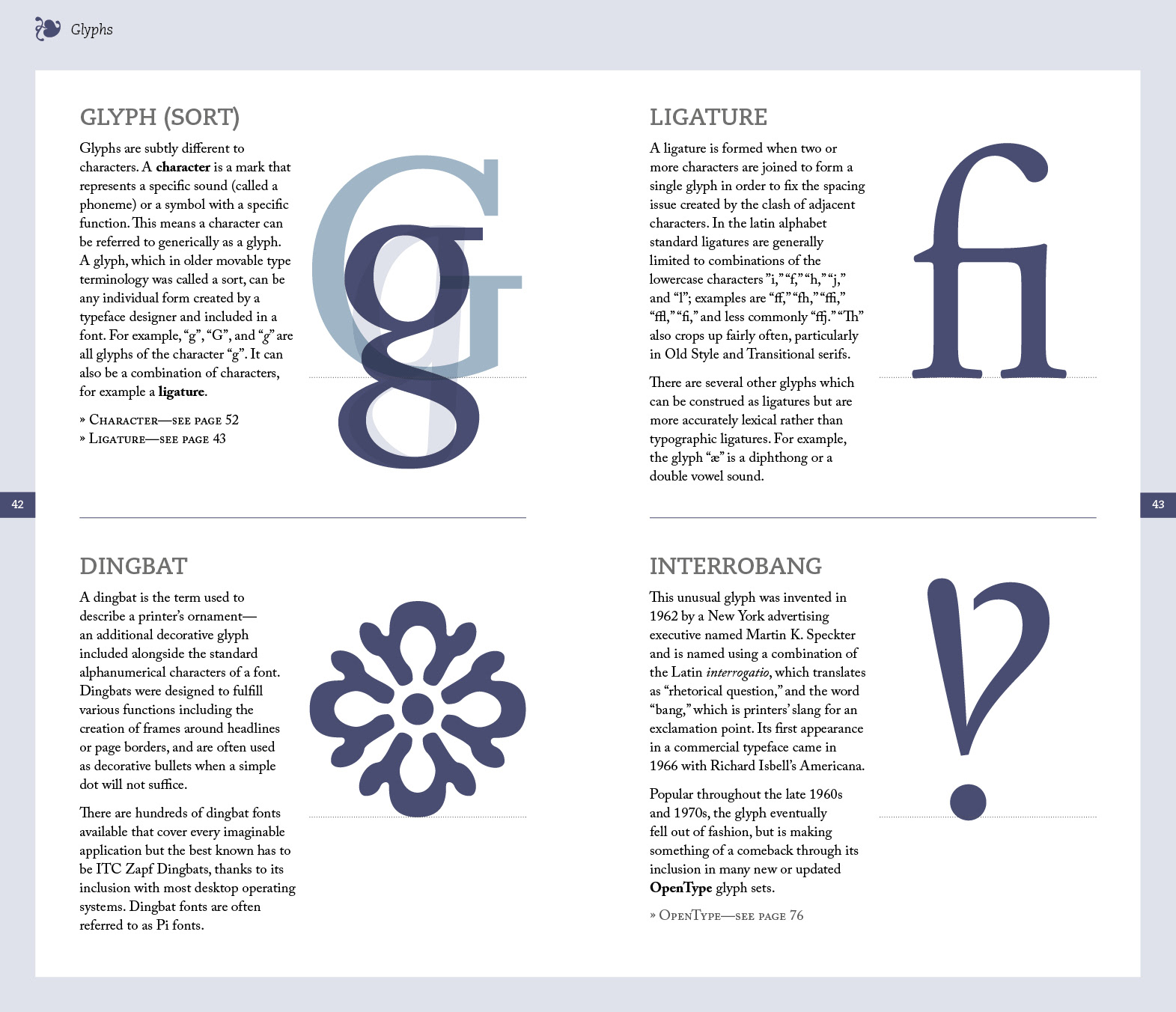
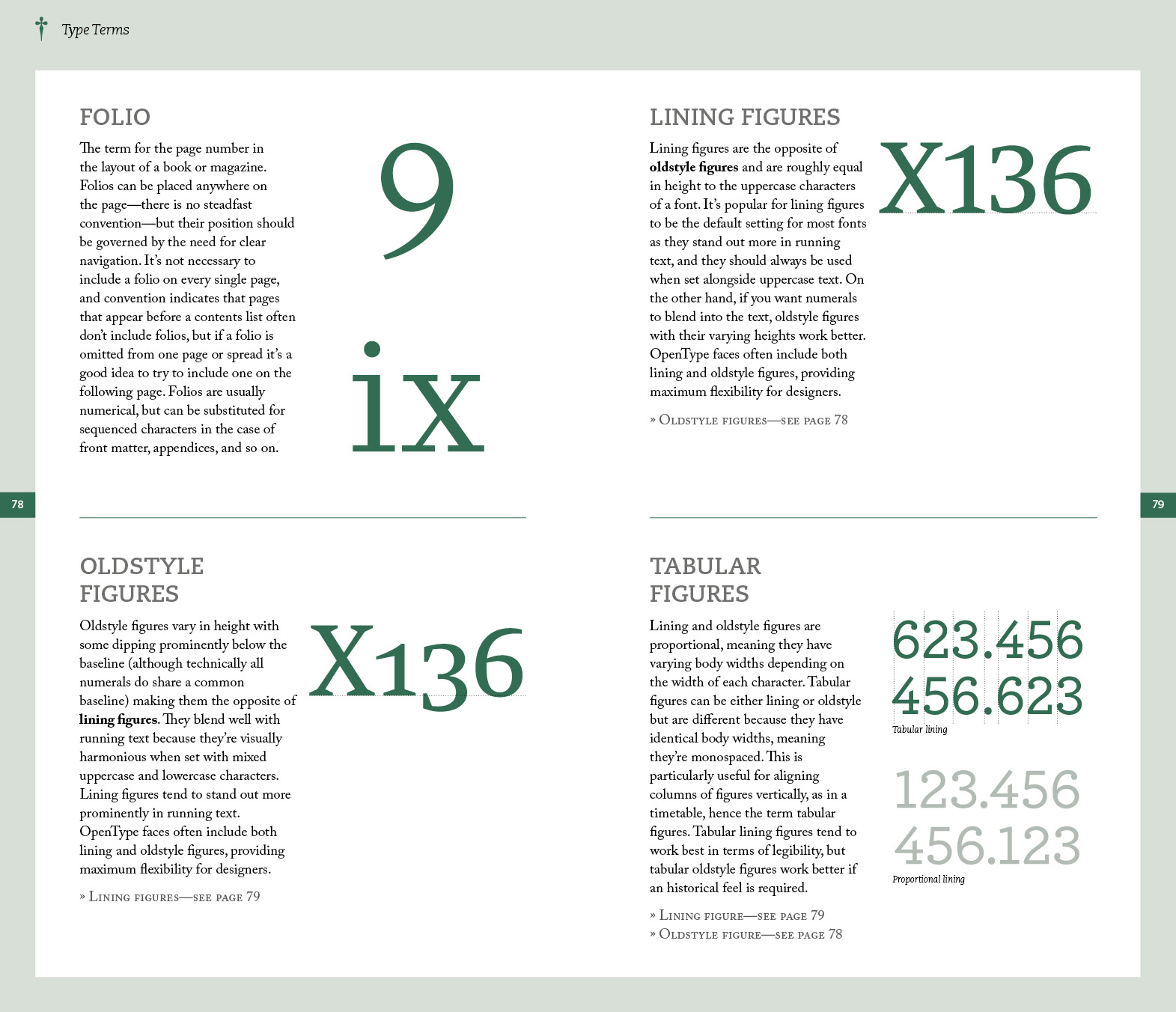
The book is split into five chapters covering the widest possible range of typographic terminology that we could include in the 192-page format. Chapter one covers type anatomy, chapter two discusses a range of specific glyphs, chapter 3 explains a broad range of typographic terms, chapter four covers typeface classification, and chapter five features a selection of essential typefaces that any graphic designer might consider adding to their collection.
It's important to note that the UK and the US editions of this book have different titles. The UK edition is titled Let's Talk Type, whilst the US edition is titled Essential Type. The covers (which were designed in-house by the respective publishers) are obviously different but the interiors are identical.
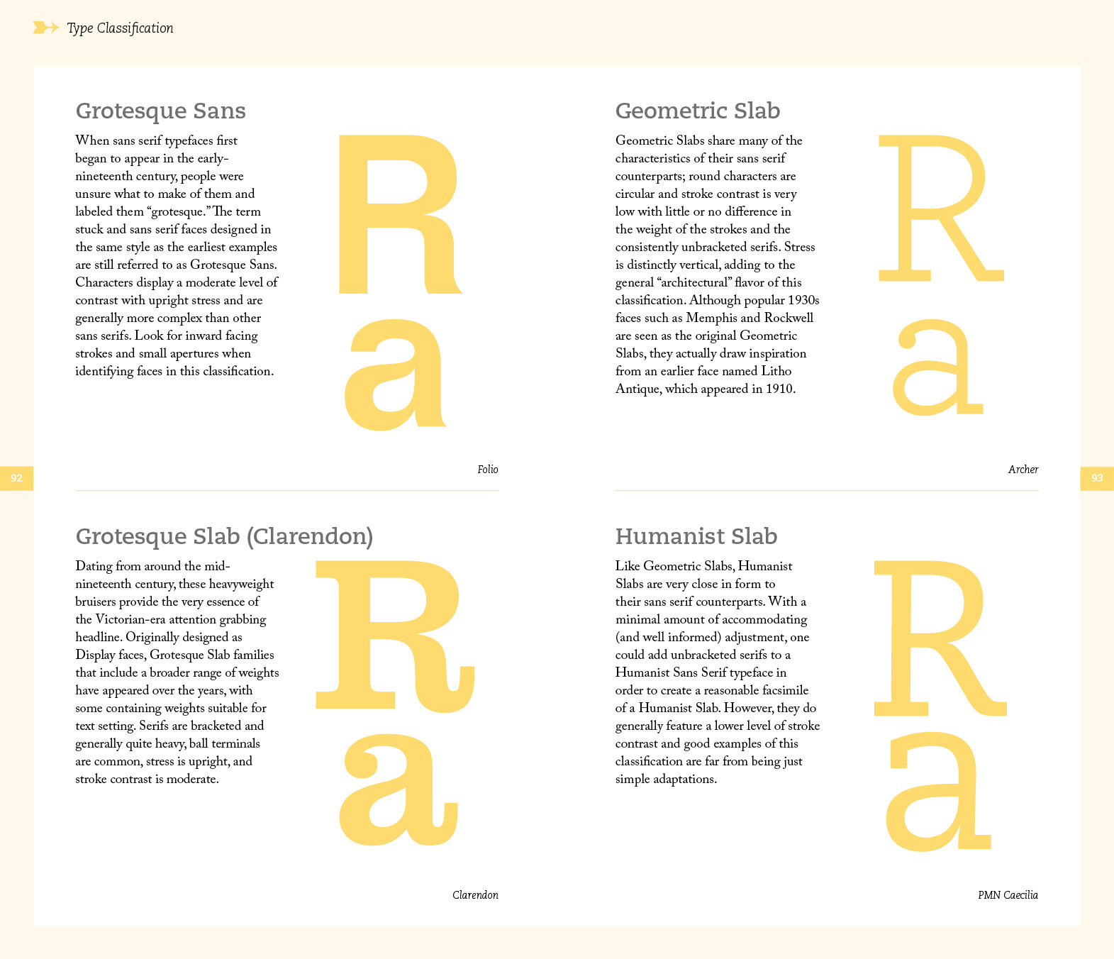
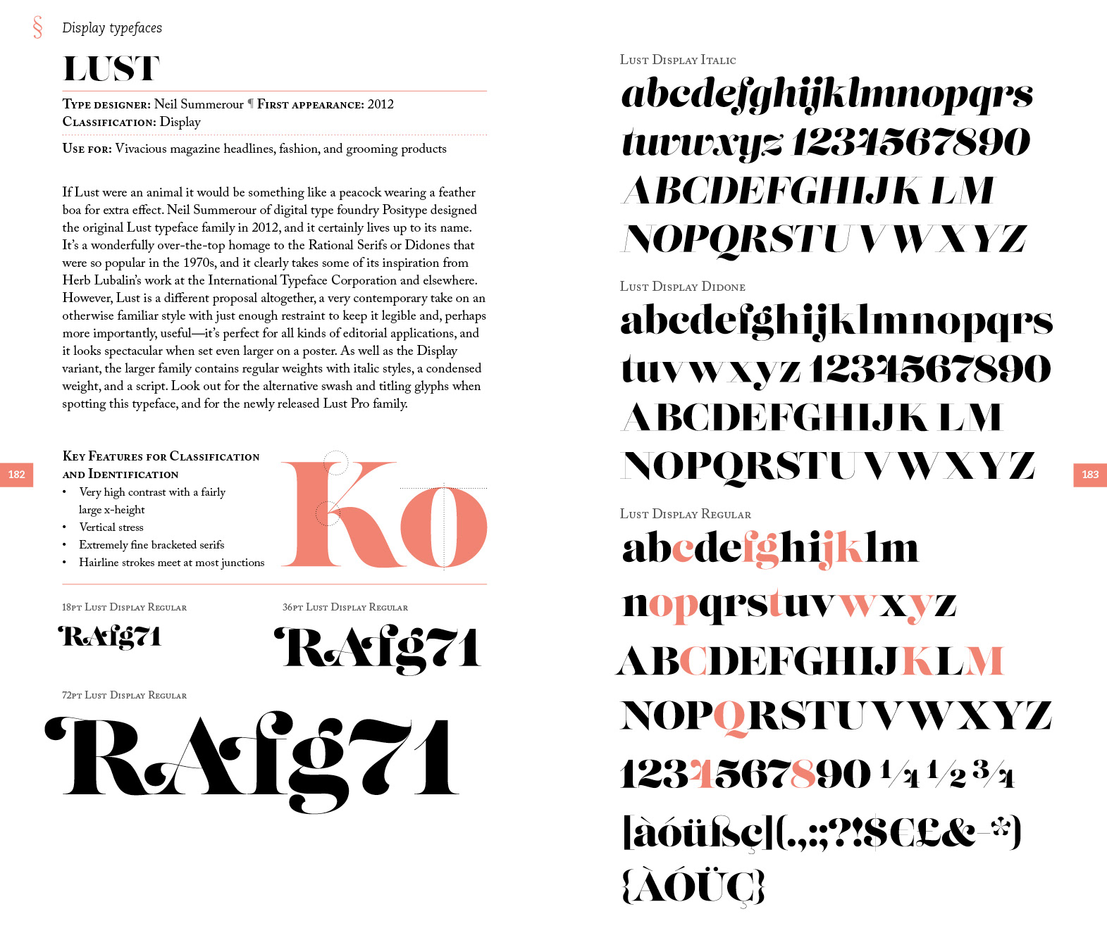
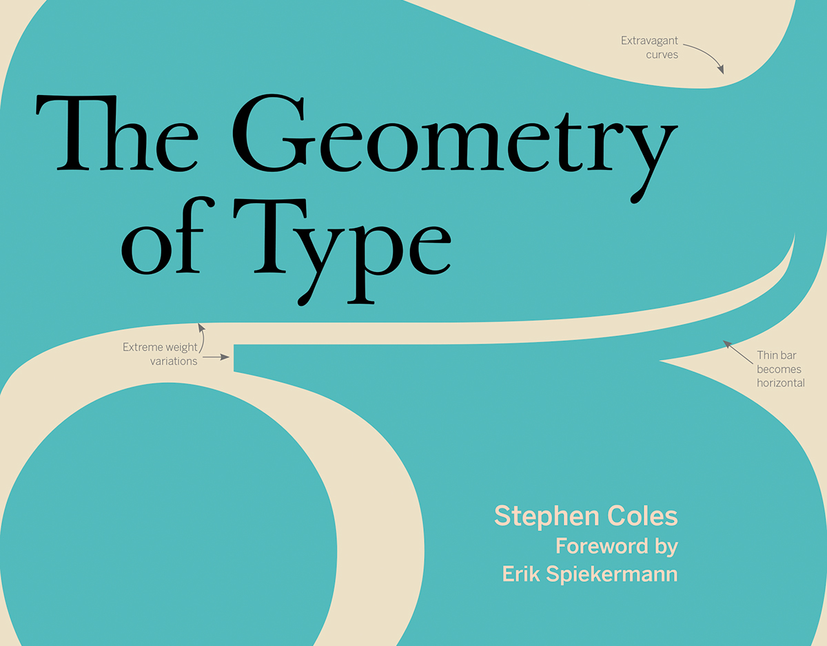
Each of the typeface sampler spreads features a "key classification" graphic to help readers identify and pair each face with other fonts that share similar characteristics. The character set also highlights key glyphs that exhibit the most prominent features of each typeface's design.